Brand Identity Systems
Trend Escape Branding
Brandon Reich Films
Haute
BIG

DAEST
Refuge Community Church

Lee Stevens, Author
Well Kids

Visual Identity Design & Art Direction
Developed tailored brand identities and logo systems for small businesses, entrepreneurs, and personal brands, creating distinctive visual marks designed to scale consistently across digital, print, and environmental applications. Each identity was crafted to reflect the client’s unique personality, audience, and positioning while strengthening overall brand recognition and cohesion.
Focus Areas
-
- Logo Design
- Brand Identity Systems
- Typography
- Visual Direction
- Brand Collateral
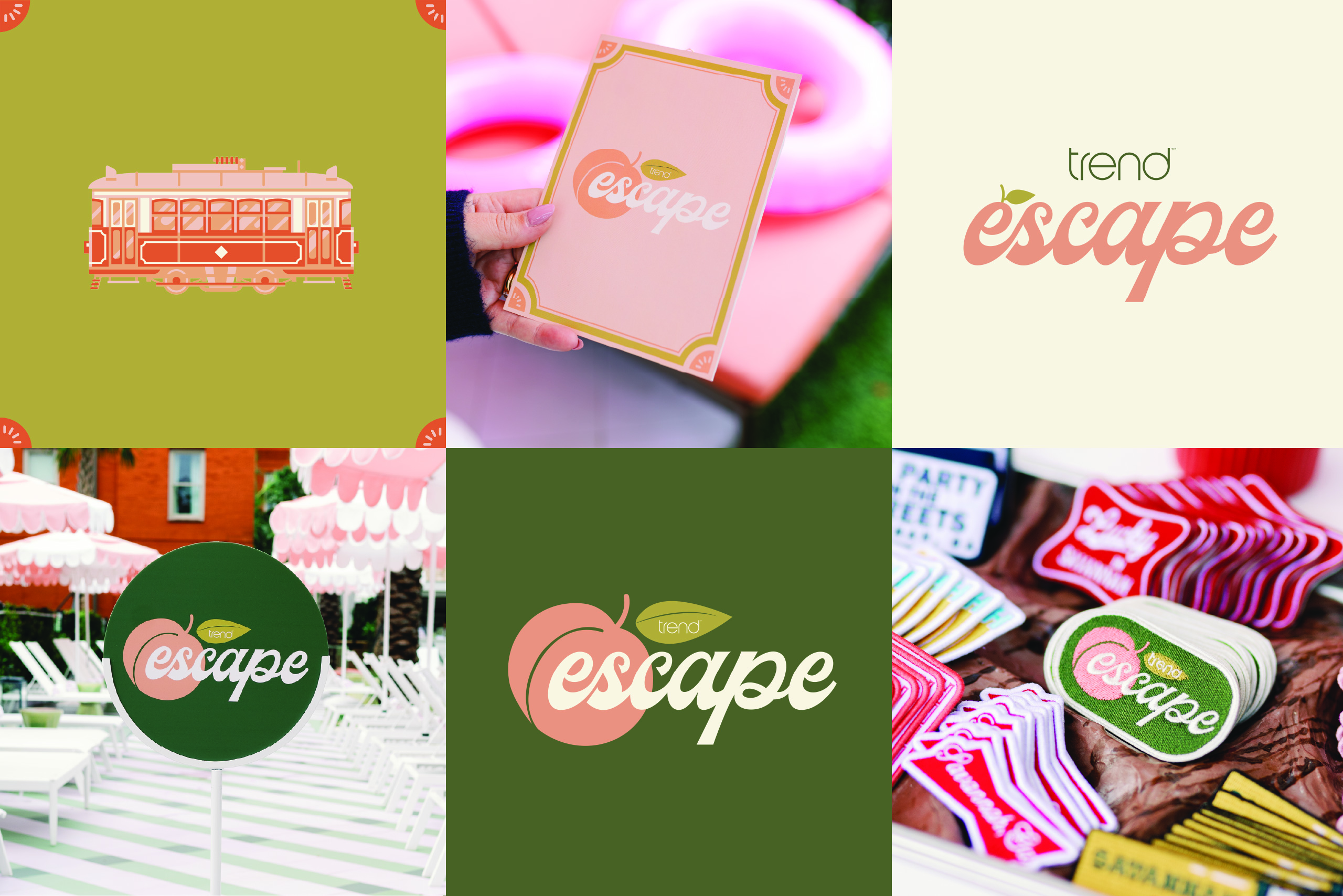
Trend Escape 2024: Savannah
Created a custom identity for an influencer getaway experience hosted in Savannah, Georgia. Inspired by Southern charm and coastal elegance, the logo combined soft typography with a subtle peach-inspired detail integrated into the wordmark to capture the warmth, sophistication, and social-forward atmosphere of the event.
Focus Areas
-
- Event Branding
- Logo Design
- Typography
- Lifestyle Brand Aesthetics
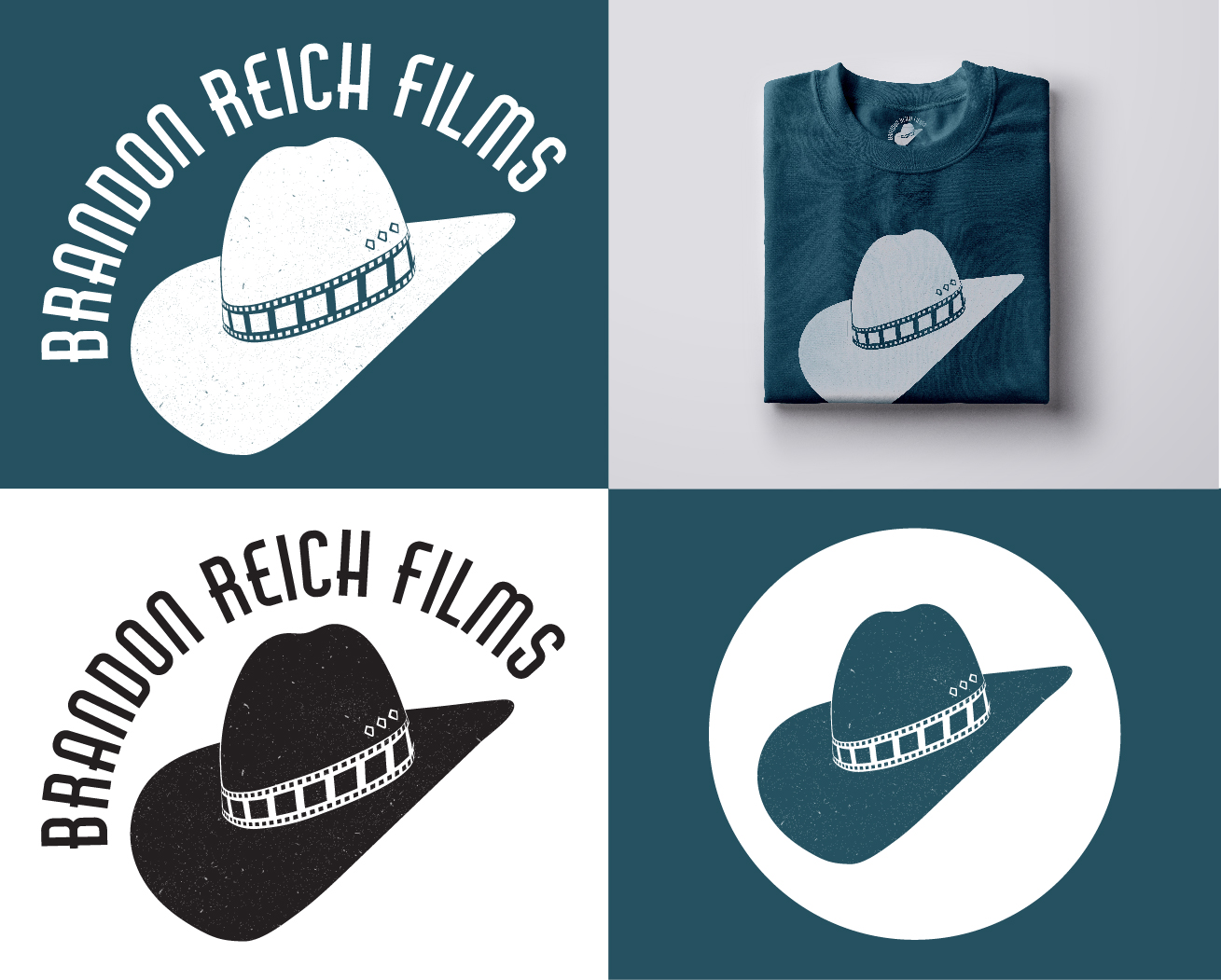
Brandon Reich Films
Designed a custom logo for Brandon Reich Films that reflected the founder’s Texas roots and understated humor. The identity incorporated a stylized Stetson hat paired with a film-strip detail while retaining the existing typeface to preserve brand recognition and familiarity.
Focus Areas
-
- Logo Design
- Entertainment Branding
- Custom Illustration
- Brand Refresh
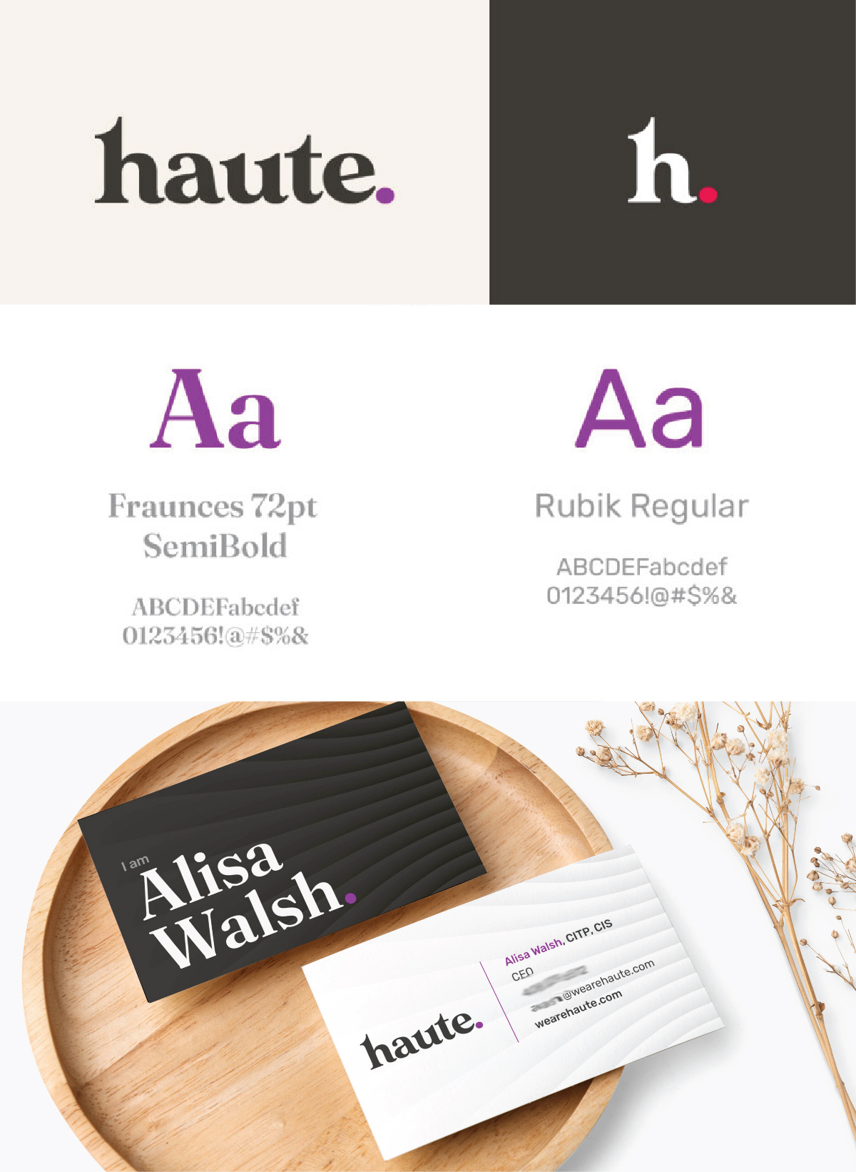
Haute
Led the development of Haute’s visual identity system, defining the brand’s typography, color palette, textures, patterns, and supporting templates across multiple touchpoints. Collaborated closely with the broader creative team to refine and evolve the logo from initial concept through final execution, ensuring a cohesive and elevated brand presence across digital and physical applications.
(Creative Direction: Diana Berno)
Focus Areas
-
- Brand Art Direction
- Identity Systems
- Design Templates
- Visual Language Development
BIG
Contributed to the redesign of a lighting rebate company’s visual identity as the business expanded its services and market positioning. Explored multiple logo directions, color systems, and graphic patterns to create a more modern and scalable brand presence aligned with the company’s evolving goals.
Focus Areas
-
- Brand Refresh
- Logo Exploration
- Color Systems
- Visual Identity Development
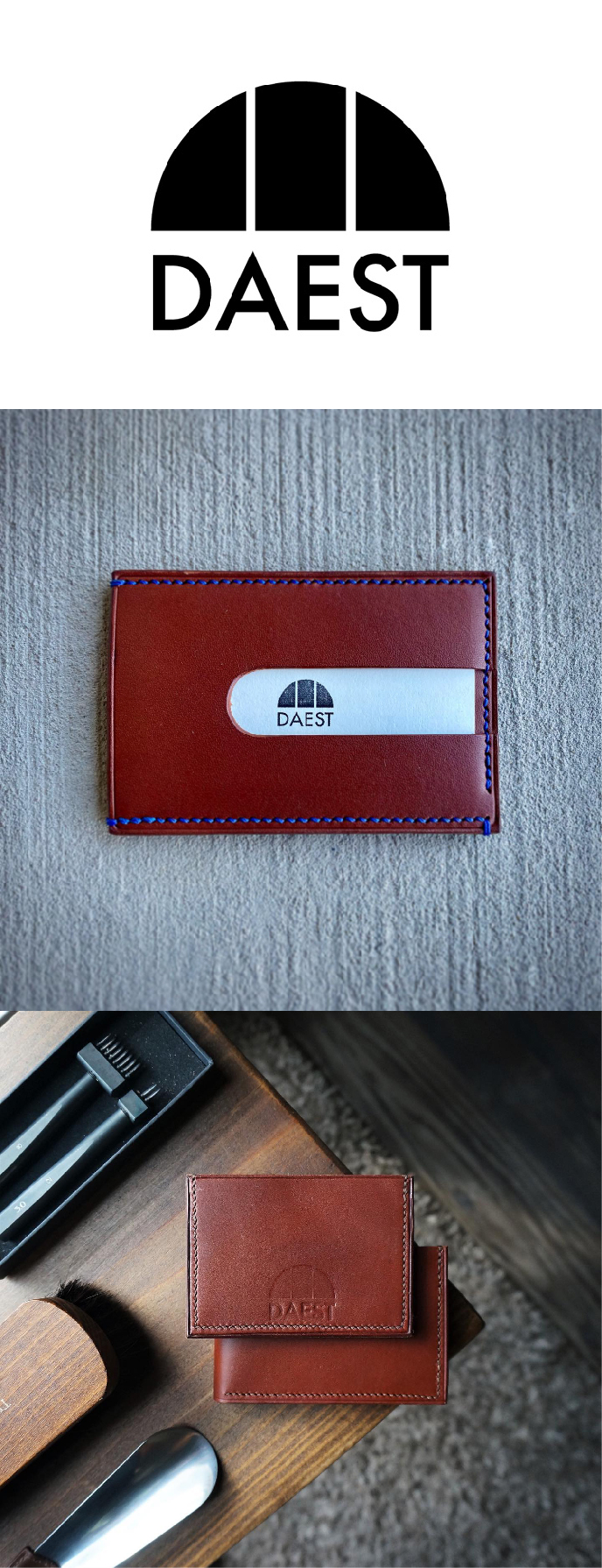
DAEST
Designed a minimal and refined logo for DAEST, a handmade leather goods company focused on craftsmanship and simplicity. The identity utilized clean lines and a segmented half-circle form to create a modern mark that reflected the brand’s understated aesthetic and attention to detail.
Focus Areas
-
- Minimal Logo Design
- Artisan Branding
- Typography
- Visual Simplicity
Refuge Community Church
Developed a modern brand identity for a new church plant centered around themes of protection, community, and belonging. The logo system incorporated clean typography with subtle architectural references to create a welcoming and contemporary visual presence.
Focus Areas
-
- Faith-Based Branding
- Logo Design
- Typography
- Community Identity
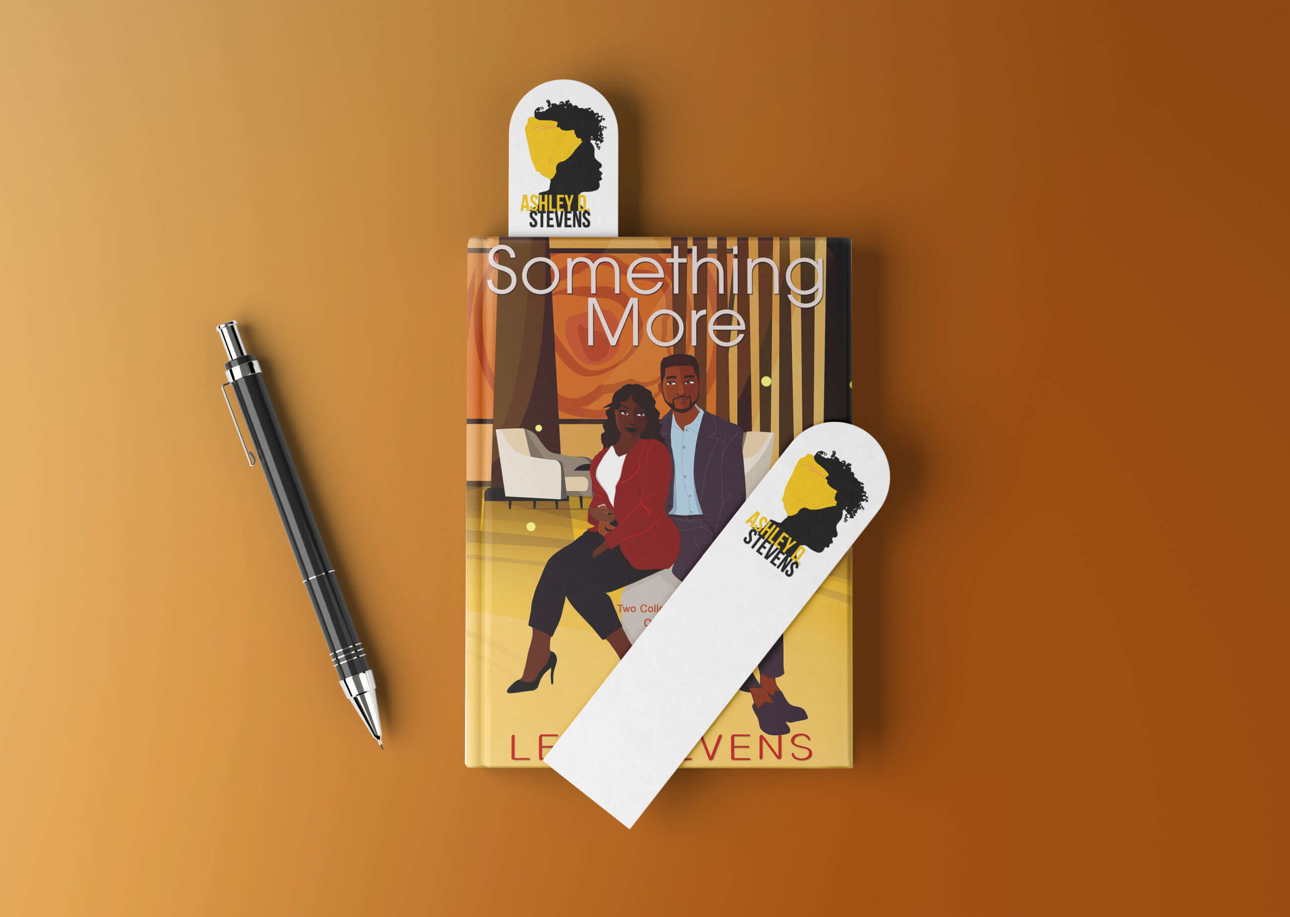
Ashley Stevens
Created a signature identity for author and blogger Ashley Stevens that reflected strength, personality, and individuality. The final logo incorporated a stylized profile illustration paired with bold yellow accents, resulting in a recognizable visual mark used consistently across her blog, publications, and personal platform.
Focus Areas
-
- Personal Branding
- Signature Logo Design
- Editorial Branding
- Visual Identity
Well Kids
Refreshed the visual identity for The Well Church’s children’s ministry by developing a more playful and approachable brand system aligned with the parent organization’s overall identity. Introduced a vibrant color palette, updated logo system, volunteer color-coding structure, and supporting collateral to create a cohesive and welcoming environment for children, families, and volunteers.
Focus Areas
-
- Children’s Ministry Branding
- Identity Systems
- Color Strategy
- Brand Guidelines
- Supporting Collateral